Following the discussion of the selection of indicators in Chapter 3, this chapter describes the data used and the processing required to generate the information input to the spatial analysis described in Chapter 5. In order to compare transit outcomes by demographics, it is necessary to link farecards to demographic data. In the absence of information directly linking a farecard to its owner’s race or ethnicity, farecards will be aggregated by tract based on the demographics of that tract. The demographics used are the American Community Survey’s data on the racial/ethnic proportions of transit commuters. In order to perform this linkage, home locations, an area where a transit user likely resides, will be inferred from each user’s usage. Farecards must first be filtered in order to have a sample of regular commuters who live near where they first access transit in the day. First the results of 1 month of OD inference are described. Next will come the steps required to filter farecards in order to have a sample of regular commuters.
Journeys occurring on business days in April 2014 are used, inferred according to the methodology presented in Chapter 2. This chapter first describes general trends in the month of journey data before discussing the selection of a sample of regular transit users. For this sample, the process of inferring their home locations is described and its validation using the American Community Survey is discussed.
Data Description and Exploration
Weekday data for April 2014 represent a sample of 18.3 million stages, and 1.55 million distinct fare cards, to be further described below. The term fare card will be used to represent individual RFID cards or magnetic strip tickets. The breakdown by medium is shown in Table 4.1 below. The large triplex tickets are produced by fare vending machines which can be located in rapid transit stations or at a number of participating retailers throughout the metropolitan area. The “old tickets” are printed for the corporate pass program, and so are primarily monthly passes.
The small triplex tickets are produced by fare boxes on vehicles and are equivalent to the remainder when a customer pays more than a fare. Smart cards are the plastic RFID equipped cards that users can use over multiple months and an individual card can simultaneously contain stored value as well as passes of different duration (1 and 7 days or a full-month).
The single use column tallies the number of users over the month who used that particular card only once in the month and that use occurred on a weekday. One can infer tickets are for the most part more disposable, less regular media with 30% of tickets being used once, whereas only approximately 8% of smart cards are only used once. The fare type for these single uses are overwhelmingly stored value transactions: a user using cash on a card or ticket in order to pay a reduced fare for a rare transit trip. Stored value is used for 28% of all transaction.
Table 4.1 Weekday Usage for April 2014 by Fare Medium
| Fare Medium | Cards | Stages | Stages/day | count |
|---|---|---|---|---|
| Large triplex roll mag. stripe | 687,427 | 3,257,460 | 155,117 | 2,261 |
| MBTA old tickets | 24,583 | 466,780 | 22,228 | 6,920 |
| Precut triplex w. mag. stripe | 24,754 | 247,301 | 11,776 | 229,093 |
| Small paper roll mag. stripe | 21,028 | 32,018 | 1,525 | 90,750 |
| Smart card mifare 1k | 793,372 | 13,916,061 | 662,670 | 15,812 |
| Cash | - | 411,545 | 19,597 | 411,545 |
| Total | 1,551,164 | 18,331,165 | 872,913 | 756,381 |
For users with more than one stage in the month, Figure 4.1 shows the number of days and weekdays each card is used, broken down by a combination of medium and whether the fare was paid with stored value or a pass. Tickets with stored value tend to be very disposable, used one or two days, and are very common, representing 60% of tickets. Smart cards with stored value are used more broadly over the month. Passes on tickets tend to be valid for fewer days, 30% of tickets are 7-day passes while only 6% are monthly passes.
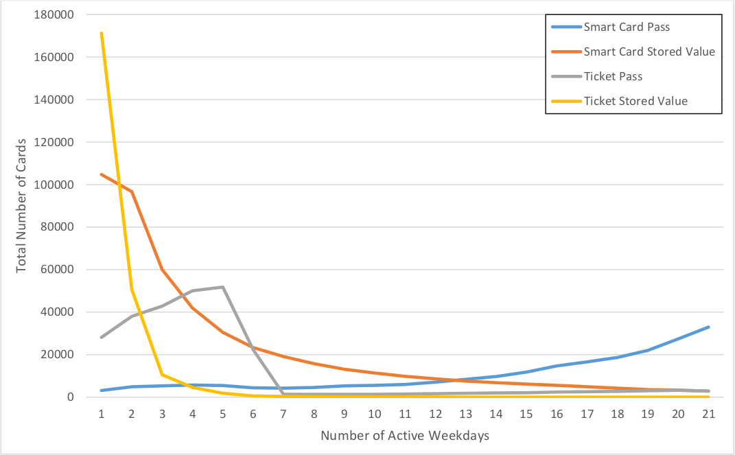
Figure 4.1 Distribution of active weekdays for April 2014
Figure 4.2 shows the distribution of stages per active weekday for the same combination of fare and medium as Figure 4.1 for users with more than 1 weekday stage. Since the ratio uses the number of weekdays the fare card was used on, the minimum usage rate is 1 and the bin of rate 1 exclusively captures users who only travel one-way for more than 1 weekday. Because they only have one stage per day, none of their destinations can be inferred, but these users tend to use stored value rather than passes.
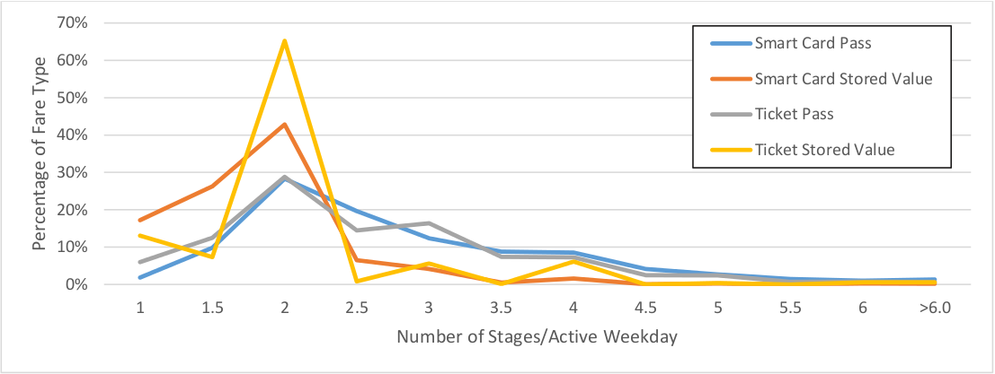
Figure 4.2 Histogram of Stages/Weekday by Fare Type
Figure 4.3 below shows individual destination inference rates as a function of the number of active weekdays. The bottom and top lines bracket the 10th and 90th percentiles rates while the middle line represents the average. In general, the destination inference rate increases as users are active on more days. This implies that the behavior of more active users closely aligns with the assumptions of destination inference namely:
- That users do not travel between transit stages using other modes
- That users return to their first origin at the end day
Defining a Sample
Since the goal of the analysis is to compare the transit experience of commuters, a subset of users who are most likely to be commuters must be extracted from the data described above. The variables used to limit this set described in the section below are:
- The number of days of activity
- Excessive activity
- Users whose pass type implies they are not commuters
- Median start time for the first weekday trip
In order to link demographics to a user’s fare card, the users should reside within a specified buffer around their origins. Thus customers who take other modes such as commuter rail, or car to access rapid transit must be excluded. This will be discussed in depth in section 4.3 which describes the process of determining home location.
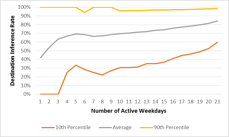
Figure 4.3 Destination Inference Rates by Active Weekday
Number of Active Days
As mentioned above, the more days a user is active, the more their transit usage follows the assumptions of destination inference. When setting a threshold for the number of days there is a tradeoff between better information about and having a smaller sample size. The MBTA prices its 7-day passes to be similar to one quarter the price of a monthly pass in order not to burden disproportionately users who have insufficient cash flow to be able to purchase monthly passes outright. Of 7-day passholders who use a smart-card, 40% of them use their card over a period of greater than 7 days (Figure 4.4). However an overwhelming majority (94%) of these passes are purchased as tickets rather than loaded onto smart cards. This means that a threshold of active weekdays beyond 5 will exclude a large and distinct population of commuters. Thus a threshold of 4 days was selected, which excludes 24% of 7-day fare cards. There remain 643 thousand fare cards used for 4 or more weekdays.
Excessive Activity
There is a small minority of cards that have so much activity over the month, in such a variety of stations, that the unique id cannot represent a unique user or fare card. These must be excluded from the final sample since destination inference is severely affected but also it is impossible to determine a home location since the card clearly represents many users. There are 4 users with more than 300 transactions in April.
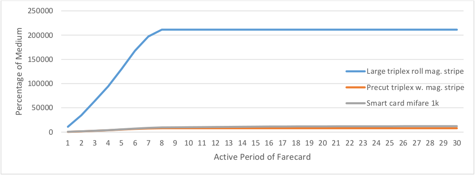
Figure 4.4 Distribution of the active period of 7-day passholders by medium (the spread of days over which the farecard is used)
Students
Students attending primary and secondary education are eligible for discounted fares. Since they represent a different population than adult commuters, these are excluded thanks to a flag in the fare type indicating the student discount. There are approximately 35 thousand farecards used for 4 or more weekdays that have a student discount.
Start Time
Figure 4.5 below shows start time for bus, streetcar, and heavy rail commuters according to the American Community Survey 5-year estimates for 2013. Individual responses were used, which are expanded to represent a full population of approximately 200 thousand regular commuters. These responses are anonymized to geographies encompassing a minimum of 100,000 known as Public Use Microdata Areas (PUMAs). Any PUMA which intersects an MBTA bus or rapid transit route was used.
The discrepancy in start time in the morning peak, approximately 30 minutes, could be partially explained by the time required to access transit from a user’s home since the ACS asks when respondents left their houses. The difference between the number of fare cards and the estimated number of commuters may be explained by a number of factors: the use of multiple fare cards, the presence of regular transit users in the AFC sample who are not considered workers by the ACS (e.g. college students, retirees, the unemployed), and commuter rail users who transfer to rapid transit.
The 95th percentile of ACS commuters was used to exclude late start times, which corresponds to a journey to work start time of 15:10. This excludes the evening peak, and thus can prevent the inference of the home location at a user’s work place should they commute to work using commuter rail and return via rapid transit. Using this median start time excludes 15% of fare cards, leaving 494 thousand fare cards.
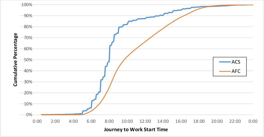
Figure 4.5 Distribution of users’ start time for the journey to work (ACS) and first journey of the day (AFC) (NAFC = 581,934, NACS= 5,541 representing 198,128 commuters)
However, there is the problem of excluding nocturnal workers: users whose workday starts so late that it spans multiple service days. Assuming an 8-hour workday and a 30 minute commute a user would leave for work at the earliest at 18:30 to return the following service day. According to the ACS this would mean that as many as 4,000 users (2%) would be nocturnal workers. These users would appear in the AFC data as having very early first transactions since their first transaction of the service day would be the return journey from work, occurring close to 3:00AM. However the proportion of AFC users with very early median starts is smaller than that found in the ACS. There is little evidence that nocturnal workers are a large group of the regular transit users. Since home location inference uses the assumption that the first origin is within walking distance from a users’ home, nocturnal workers should be excluded from this inference. An alternative to infer their home locations should be developed.
Determining Home Locations
In order to link a customer’s observed activity to the demographics of their neighborhood it is necessary to infer their home location, a region where it is probable that that customer resides. In order to avoid the population fallacy the following disclaimer must be made: while location inference is made at the individual-level, it would be incorrect to assign characteristics of a population to an individual. Instead the goal of this location inference process is to aggregate the individual-level information about transit usage by zones for which demographic information is known.
One must first determine which activity can be used to infer the location of users’ home. With the assumption that users are at home when the service day begins at 3AM then the user’s first trip of the day is made from near their home. It is possible to infer home location from the first origins of a user’s day.
The current state of the practice for equity analysis by the CTPS is to draw buffers around every stop and assign the characteristics of the surrounding areas to stops. This aggregates a lot of variety in census tracts around stops. Figure 4.6 below shows the distribution of the number of census tracts within a 1 km buffer around stops, and rail stations. It may be possible to infer more precisely the area from which users originate through processing their use of transit over time.
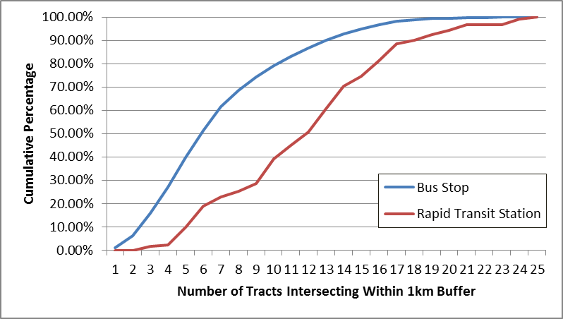
Figure 4.6 Distribution of Number of Census Tracts Intersecting 1km Buffers around MBTA Stops and Stations
With the information available from many days of OD inference, it is also possible to examine user behavior in finer detail. Rather than linking together aggregate flows with the demographics surrounding stops, the goal of this process is to be able to examine travel patterns at finer spatial resolution to determine how the transit system could better serve users. By looking at each user’s history, it should be possible to infer the area wherein they probably reside with greater precision. The methodology for this is the subject of this section, with carefully selected example users to guide the reader through the process. To preserve anonymity the underlying geography has been removed.
From this filtered set of first origin stops, one could use the most frequented origin, however this would ignore information from other stops frequented by the user, and could use multiple stops equally. The weighted centroid could be used, but there needs to be a method to exclude outlier stops. Clustering is required to group together similar stops and exclude outlier stops, this can be performed by a spatial hierarchical clustering algorithm.
Spatial Clustering of Stops
In order to group together stops at a similar location, which are within walking distance, hierarchical clustering is used. The algorithm groups together stops that are closest to each until a maximum cluster diameter is reached. Initially each stop in a user’s collection of first origins is its own cluster. For each user’s collection of first origins the algorithm then runs in the following loop:
- Find the two closest clusters to each other.
- If the distance between the furthest points in the two clusters is less than the specified maximum diameter, then group the two clusters together.
- If the distance between the furthest points in the two clusters is greater than the specified maximum diameter, then no further clusters can be formed and the algorithm ends
Assuming that users will not walk further from their homes than the maximum destination inference distance of 1000m, the maximum diameter of any cluster is specified as twice a radius of 1000m.
The hierarchical clustering algorithm was run on weekday ridership for April 2014. Of 494 thousand users, 414 thousand had first origins that could be clustered. The rest exclusively used Green Line or Mattapan as first origins. Figure 4.7 shows the distribution of the number of clusters per user.
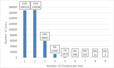
Figure 4.7 Distribution of Number of Clusters per User
From the clustered groups of stops, the cluster where a user most frequently begins their day is most likely the one close to where they live. For users who start their weekdays in 2 or more clusters equally (see Figure 4.9), the smallest cluster is selected. Table 4.2 shows the distribution of these clustered users by ticket type.
For users with 2 or more clusters, Figure 4.8 shows the sensitivity of the clustering algorithm to the maximum cluster diameter parameter, giving the distance to the nearest stop outside of the primary cluster. No user has another first origin within 200m of their primary cluster, and 99% of users do not have a first origin within 1000m of their primary cluster, indicating that the 1000m cluster radius is adequate.
Table 4.2 Distribution of Users by Ticket Type
| Ticket Type | Number of Cards | Cumulative Percentage of Regular Users |
|---|---|---|
| Monthly RT Pass | 136042 | 32.69% |
| SV Adult (SC) | 117649 | 60.97% |
| 7 Day Link Pass active FVM/TOM/RST | 111559 | 87.78% |
| Commuter Rail | 19793 | 92.54% |
| ID with SV Senior | 10530 | 95.07% |
| TAP & Blind | 8382 | 97.08% |
| SV Ticket | 5960 | 98.51% |
| Monthly Link T.A.P. | 5219 | 99.77% |
| The RIDE ID | 453 | 99.88% |
| Commuter Boat Pass | 204 | 99.93% |
| ID w/o SV Retiree | 197 | 99.97% |
| Public Official Ids w/o SV w Pb | 62 | 99.99% |
| Permit Senior/TAP 30 days validity | 51 | 100.00% |
| Local Bus Monthly Pass Adult | 1 | 100.00% |
| ID without SV Blind 1 yr. Validity | 1 | 100.00% |
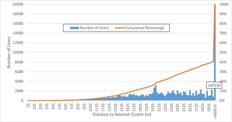
Figure 4.8 Distribution of Distance to Nearest Cluster for Users with >1 Cluster (N = 246,986)
Figure 4.9 shows the distribution of the importance of the each user’s primary cluster, the cluster from which the greatest number of weekdays began. The importance is quantified as the proportion of days started in the primary cluster versus the total number of active days. One can see that 97% of users start more than 50% of their weekdays within their primary cluster. For the 3% who start more than half their weekdays outside of the primary cluster, there may be multiple clusters from which the user started the same number of days.
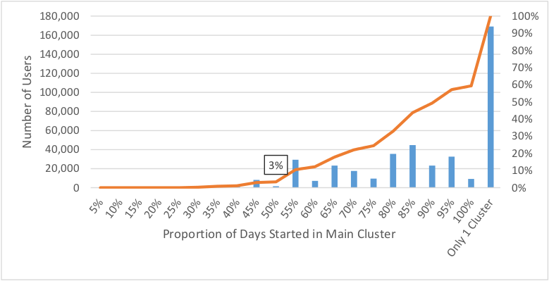
Figure 4.9 Histogram of Importance of Primary Cluster
Customers who do not Reside near Transit
Since this analysis requires that users live within walking distance of the stops from which they start their day, users for whom there is evidence that they do not live close to these stops should be excluded from the analysis. These users access transit stops and stations via modes other than walking, principally driving or commuter rail.
Users who Access Transit via Auto
Based on surveys of users, the CTPS has determined which stations are accessed primarily via auto or similar modes. Any user whose primary cluster exclusively contains these stations likely does not live near these stations and should therefore be excluded from the resulting sample.
Commuter Rail Users
Users who use both the urban transit network and commuter rail regularly can be identified by the ticket types that they use. If these users begin their days accessing urban transit at commuter rail stations then they have likely transferred to the transit network from commuter rail. The following are rapid transit stations which have commuter rail service:
- Back Bay
- Braintree
- Forest Hills
- JFK/UMass
- Kenmore
- Malden Center
- North Station
- Porter Square
- Quincy Center
- Ruggles
- South Station
Using GTFS data it is also possible to identify bus stops that are located within these stations by joining based on the parent_station column. Of the 20,097 transit users who have a commuter rail pass, 14,634 start the majority of their days on transit at stops which are located at a commuter rail station. Table 4.3 shows the distribution of the commuter rail stations where these commuters most commonly access the public transit network. Fractions appear in the totals because 11 users use 2 stations equally over the month. There is anecdotal evidence that commuter rail users may board buses at commuter rail stations by presenting their passes for visual inspection at peak times rather than having their pass validated by the AFC system, explaining the low ridership at Ruggles, a major bus hub.
Table 4.3 Distribution of the Stations through which Commuter Rail Commuters Access the MBTA’s Urban Transit Network
| Station | Number of Users |
|---|---|
| North Station | 5511.5 |
| South Station | 4835 |
| Back Bay Station | 2187 |
| Porter Square Station | 1140 |
| Ruggles Station | 275.5 |
| Malden Center Station | 198 |
| Forest Hills Station | 192 |
| Braintree Station | 107 |
| JFK/UMass Station | 66 |
| Quincy Center Station | 64 |
| Kenmore Station | 58 |
The goal of this filtering process is to retain only users who are likely to have walked to their first origin observed by the AFC system, therefore all commuter rail users have been excluded.
The Information in stops that were not used
Voronoi polygons represent regions of space that are closer to a point than any other. Their boundaries represent a line that is equidistant between two points. When a set of Voronoi polygons are generated using a set of stops for a given route and direction then an individual Voronoi polygon represents the catchment area for a given stop. An individual taking the bus in a particular route and direction at a given stop likely started walking towards that stop within the stop’s Voronoi polygon, since the represents the region which is closer to that stop than any other for the desired service. Figure 4.10 provides an example of these polygons for the inbound direction of Route 01. To more accurately represent a catchment area, each polygon should be clipped by a buffer of a reasonable walking distance around its respective stop.
Voronoi polygons were generated for every bus pattern, a unique combination of route, direction and sequence of stops, and for every rapid transit line.
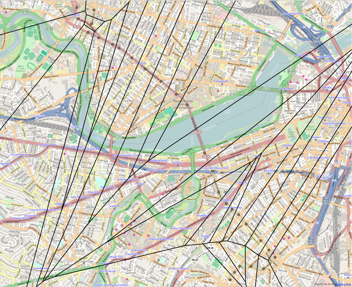
Figure 4.10 Voronoi Polygons Created for the Inbound Direction of Bus Route 01 (Basemap licensed under CC-By-SA from OpenStreetMap)
The home area is the area of the Voronoi polygons of the first origins used by an individual within their primary cluster. The centroid, the single point where the user would most likely reside given their transit usage, of each user’s stops is calculated, weighted by the number of times each stop is used. A Euclidean buffer is drawn around the centroid, the radius of which is 1km or the distance from the centroid to the furthest point in that cluster, whichever is greater. This buffer represents the walkshed of that user for those stops, around the centroid. The Voronoi polygons, the catchment areas for each stop, are then clipped by a buffer around the user’s weighted centroid. The union of these clipped catchment areas is the deemed the user’s home region location: the area within which the user likely resides.
Joining to Census Tracts
The home areas are intersected geometrically with census tracts, the smallest geographic unit for which the demographic breakdown of transit riders is available from the ACS. Tracts where no transit riders live, such as parks, are subtracted from home areas. Weights are assigned for the probability of each user (j) residing in tract (i) according to Equation 41 below
Equation 41 Weighing a User’s Probability of Residing in a Given Tract
[p_{\text{ij}} = \frac{A_{j} \cap A_{i}}{A_{j}}\text{\ \ }]
Where ({(A}{j} \cap A{i})) is the area of the intersection of user j’s home area and census tract i
These weights will be used to aggregate statistics from user journeys in 4.4 and the spatial analysis of transit effectiveness in Chapter 5 below.
Example
Taking a particular user as an example. This person started their weekdays at 6 distinct bus stops during April for a total of 21 active travel days. Figure 4.11 shows these stops mapped with the stop markers scaled by the number days the used started at each one.
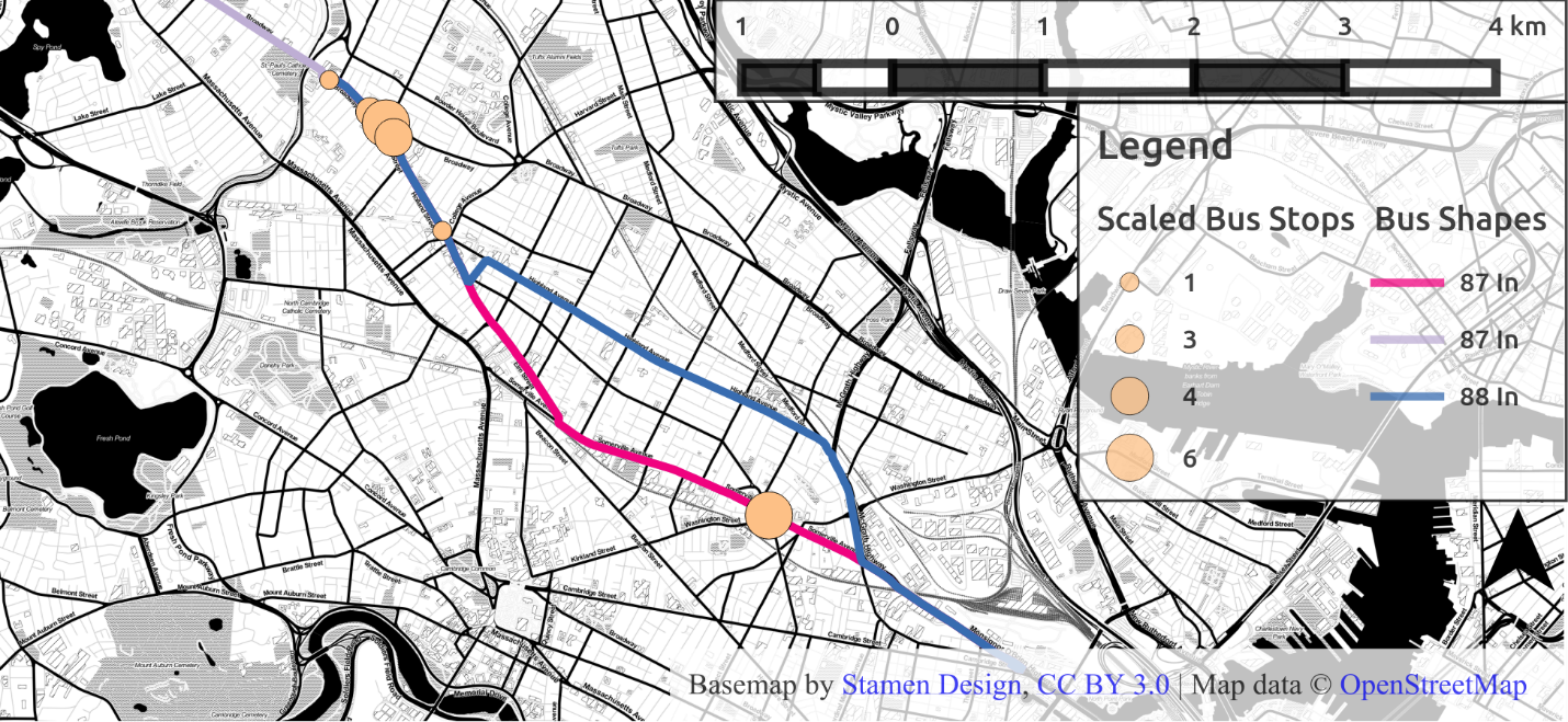
Figure 4.11 Initial distribution of stops, scaled by number of days started at that stop
The map also features the bus routes used to make the first trips of the day: the 87 Inbound and the 88 Inbound. Both these routes serve the stops to the Northwest, which is near Davis Square in Somerville. The distance between the furthest stops of this collection of stops is approximately 4.1km.
The hierarchical clustering algorithm groups together stops which are close together and within 2km of each other. Figure 4.12 shows the results of hierarchical clustering for this example user: where the stops to the northwest are clustered separately from the stop to the southeast (now blue). Since the user started more weekdays in the month from stops in the beige cluster, these are assumed to be the stops closest to that user’s home, and within walking distance.
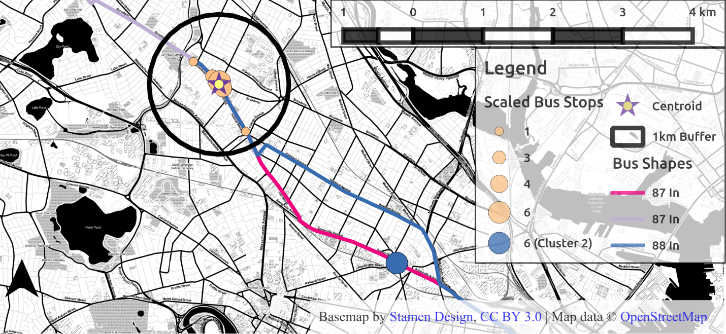
Figure 4.12 Distribution of stops post clustering, with 1km buffer around new centroid
The weighted centroid for this cluster is represented by the star. This point is the center of the stops near the user’s home, weighted by the frequency with which the user used each stop. A 1 km Euclidean buffer is drawn around these stops, representing the first guess at a region in which the user probably resides.
But it should also be possible to use information about what stops the user did not use to better infer where there home location may be. The Voronoi polygons for the stops of each route the user boarded at represent the catchment area for each. By selecting only the polygons for the stops which were used, one excludes the catchment areas for the stops not used from the user’s probable residence. Figure 4.13 shows the catchment areas for the stops from which the user began their day. Assuming the user is equally likely to reside in the area representing the union of these areas, then the percentages represent the probability the user lives in any given polygon. This example shows that this will weight termini more heavily, since terminal polygons, like the stop on the left, will be much larger than intermediate stops.
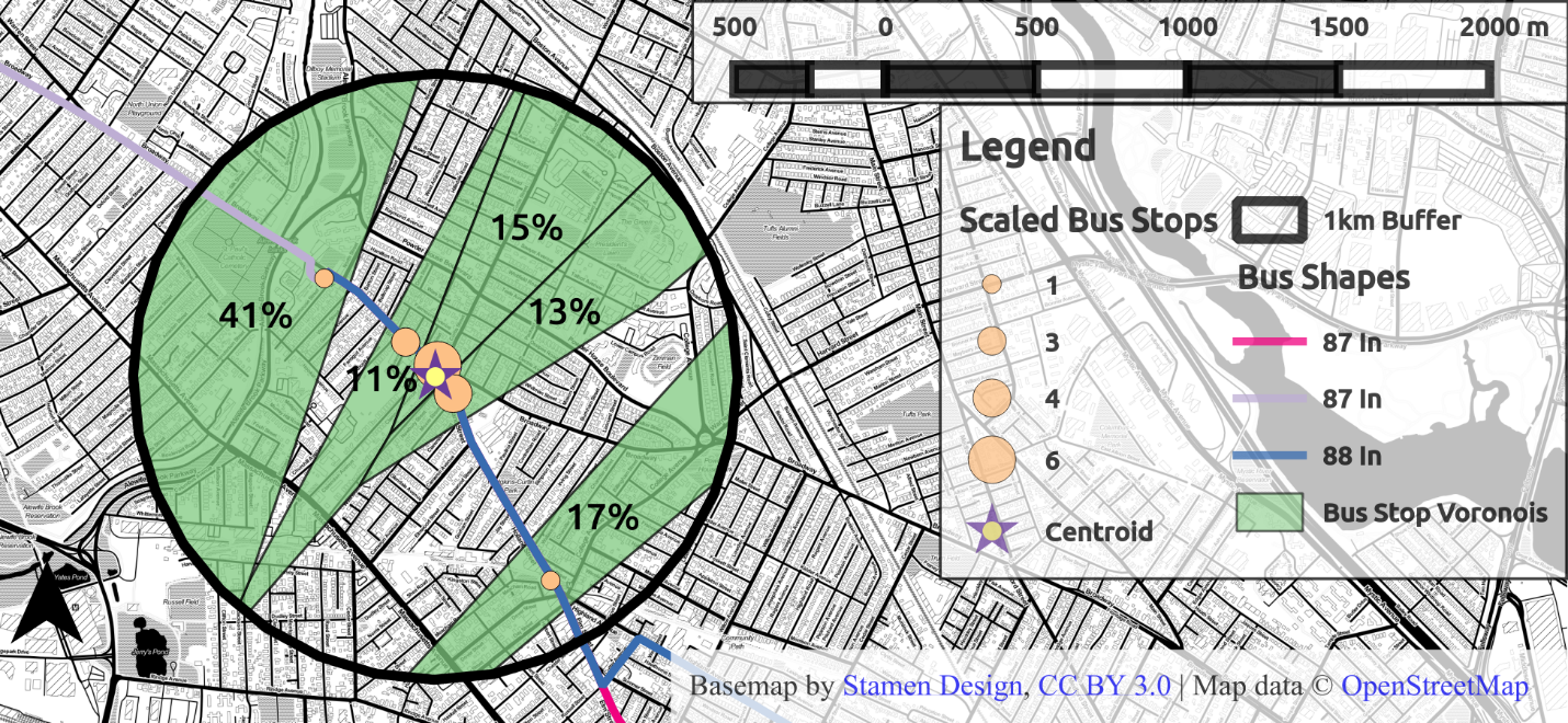
Figure 4.13 Clustered stops and home area in green
Taking the intersection of the Voronoi polygons with census tracts produces Figure 4.14, where now the percentages reveal the probability of the user residing in any given census tract outlined in red. Attributes from the user’s observed transit journeys can now be aggregated by census tract using those probabilities as weights.
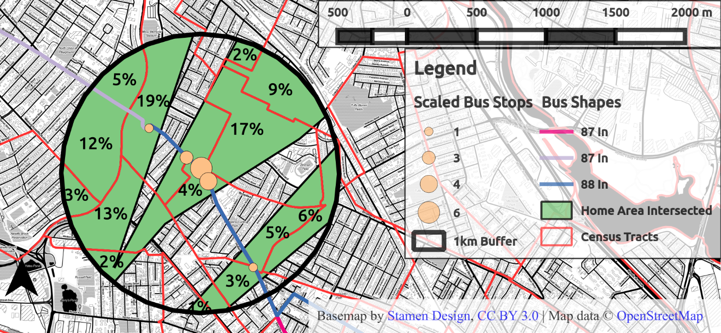
Figure 4.14 Home area intersected with Census Tracts
Final Sample
The final sample is of 328 thousand fare cards who have travelled a total 10.6 million weekday stages and 4.3 million first weekday journeys in April 2014.
Validating with American Community Survey
This method was validated using data from the U.S. Census bureay’s 2013 5-year estimates of the Means of Transportation to Work by Selected Characteristics (S0802), which were available at a Census Tract resolution. Census tracts which had no estimated transit commuters were excluded, since these enclosed large urban parks. The number of commuters residing within each tract was estimated using Equation 42.
Equation 42 Estimating number of commuters per tract
[C_{i} = \sum_{j = 1}^{J}{C_{\text{ij}} = \sum_{j = 1}^{J}\frac{{(A}{j} \cap A{i})}{\sum_{i = 1}^{I}{{(A}{j} \cap A{i})}}}]
Where:
({(A}{j} \cap A{i})) is the area of the intersection of user j’s home area and census tract i
(\sum_{i = 1}^{I}{{(A}{j} \cap A{i})}\ ) is the total area of user j’s home area which is present within census tracts, and therefore
represents the probability that user j resides within tract i
The map in Figure 4.15 shows the result of this operation. There is a high density of users along the heavy rail lines, and very low density in the outer suburbs.
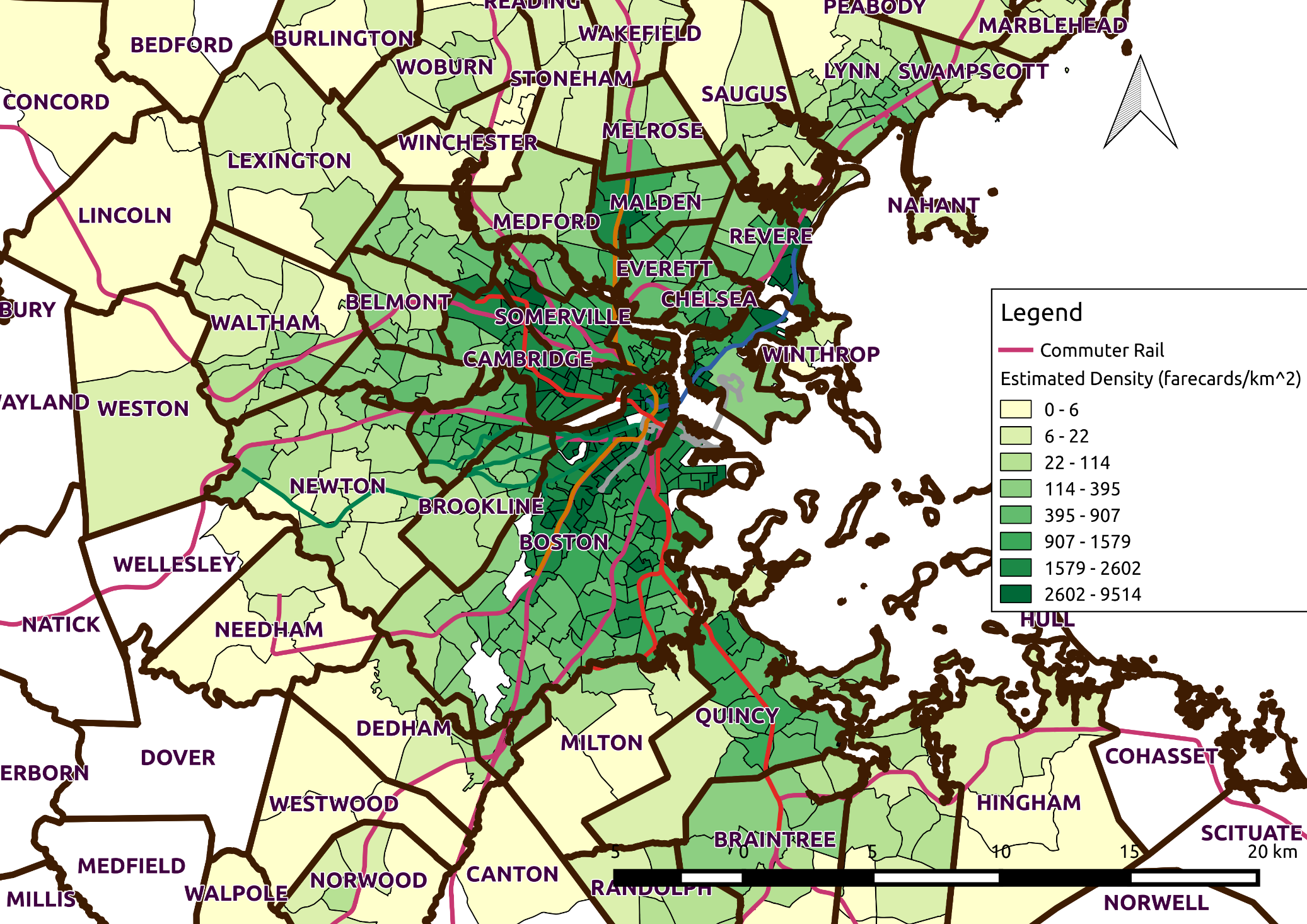
Figure 4.15 Map of Commuter Density from AFC Estimate
The map in 4.16 shows the comparison between the estimated number of commuters from AFC data and the estimates from the ACS. The beige cells represent the AFC estimate being within the error range for the ACS estimates. In the suburbs the AFC method tends to undercount with respect to ACS, likely due to the ACS including commuter rail users in quantifying public transit commuters. The AFC estimates tend to over count the users in the tracts along the heavy rail corridors. The AFC estimates will in general tend to be high since there are 328 thousand farecards to the ACS’s estimated 240 thousand commuters (which includes commuter rail users).
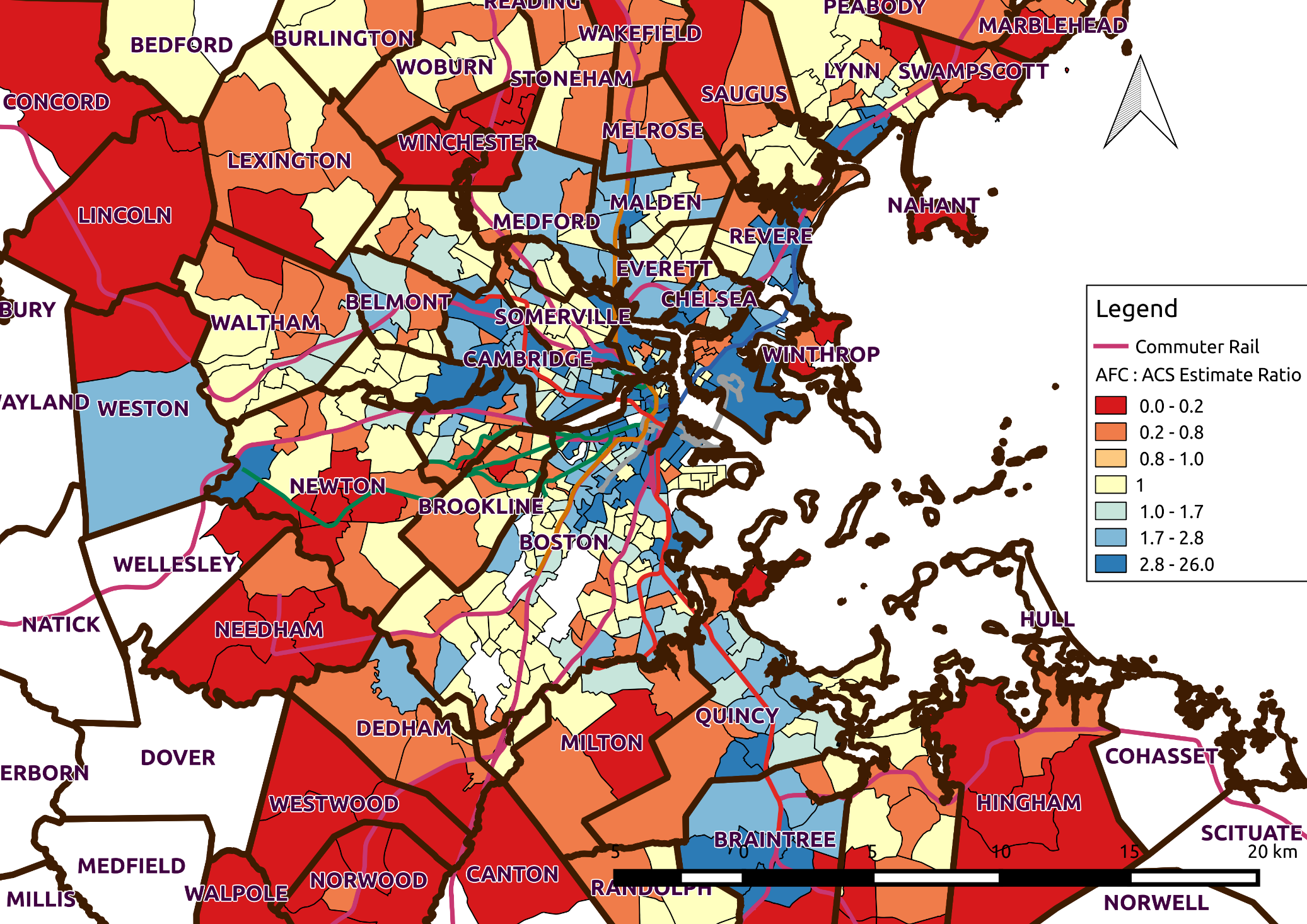
Figure 4.16 Map of Ratio of AFC: ACS Estimated Commuters
Future Research
Using Network Distances
Much of the work in this chapter was performed using an assumption of euclidean geometry: that pedestrians are walking about on a flat plane. This approximation of the street network is computationally efficient, but not necessarily accurate, in particular over smaller distances (Okabe, Satoh, Furuta, Suzuki, & Okano, 2008). The pedestrian street network should be used to construct Voronoi polygons and buffers.
The home location inference process should be validated with survey data where researchers can link the transactions used in the process to a home address.
Other Applications
The inference of locations of interest from inferred origins and destinations is not limited to residences. Other locations of activities, such as work, study, or recreation can be inferred using this procedure or its variants. See for example, Goulet-Langlois (2015) identifying user typologies based on transit travel and time spent at different activities at TfL.
Summary
This chapter has presented the processing required to generate the inferred journey data to be used in the analysis performed in the following chapter. A sample of users who are regular commuters and who likely live near their first origins in the day is selected from weekday users during April 2014. From this sample home locations were inferred by analyzing the spatial distribution of these users’ first origins. Home locations were then intersected with Census Tracts, the geographic unit containing the demographic breakdown of transit commuters. From the intersection of tract and home location, weights were derived, representing the probability that a given user resides in a given tract, in order to aggregate the 4.3 million first weekday journeys in April 2014 made by 328 thousand fare cards who are regular commuters by tract. This aggregation by tract is necessary to the analysis of travel time differences between users from areas with predominantly Black or African American public transit commuters compared to areas with predominantly White public transit commuters discussed in Chapter 5.