How to Plot Percentile Bands over Time from Big Data in Python and PostgreSQL
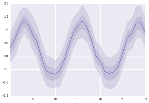
I was trying to plot some… “big data” in seaborn recently and the computer/database connection was having a real struggle. I was aiming to have something like this example from the tsplot documentation, but pulling ~150k observations over 48 months. Our database connection/my workstation was not happy. Spoiler Alert: in this post I will eventually realize that seaborn wasn’t doing what I thought it was, and some of the neat tricks I learned in PostgreSQL don’t apply to the solution I eventually found, but I wanted to leave them in case you might find them useful.
%matplotlib inline
import matplotlib.pyplot as plt
import seaborn as sns
from psycopg2 import connect
import pandas.io.sql as pandasql
import numpy as np
import pandas as pd

np.random.seed(22)
sns.set(color_codes=True)
x = np.linspace(0, 15, 31)
data = np.sin(x) + np.random.rand(10, 31) + np.random.randn(10, 1)
ax = sns.tsplot(data=data, ci=[50, 90], color="m")

After some thinking, I realised that I should be making the database do more of the work. First, some test data:
WITH categories AS (SELECT generate_series(1,5) as category)
, numbers AS (SELECT generate_series(0,100) as val)

SELECT category, val as val
INTO TEMP TABLE test
FROM categories
CROSS JOIN numbers;
Why should my workstation be calculating all these percentiles? Can’t we make PostgreSQL do that? (yes we can). But I had a problem, if I did something like the below query:
SELECT category,
percentile_cont(0.25) WITHIN GROUP(ORDER BY val),
percentile_cont(0.5) WITHIN GROUP(ORDER BY val),
percentile_cont(0.75) WITHIN GROUP(ORDER BY val)
FROM test_data
GROUP BY category
I would have a separate column for each percentile, which isn’t easily going to fool seaborn (yes there’s another problem too, we’ll get to that).
| category | p_25 | p_50 | p_75 |
|---|---|---|---|
| 1 | 25 | 50 | 75 |
| 2 | 25 | 50 | 75 |
| 3 | 25 | 50 | 75 |
| 4 | 25 | 50 | 75 |
| 5 | 25 | 50 | 75 |
The solution? A clever hack of using unnest and PostgreSQL arrays. ARRAY[col1, col2] will create a single column of type ARRAY[], and then unnest will create unpack an array, creating a new row for each array element.
SELECT category,
unnest(ARRAY[
	percentile_cont(0.05) WITHIN GROUP (ORDER BY val),
	percentile_cont(0.25) WITHIN GROUP (ORDER BY val),
	percentile_cont(0.50) WITHIN GROUP (ORDER BY val),
	percentile_cont(0.75) WITHIN GROUP (ORDER BY val),
	percentile_cont(0.95) WITHIN GROUP (ORDER BY val)])
AS val
FROM test
WHERE category < 3
GROUP BY category
Produces the following:
| category | val |
|---|---|
| 1 | 5 |
| 1 | 25 |
| 1 | 50 |
| 1 | 75 |
| 1 | 95 |
| 2 | 5 |
| 2 | 25 |
| 2 | 50 |
| 2 | 75 |
| 2 | 95 |
So the catch here is that you have to make sure that the length of the array of percentiles that are getting calculated by the database matches up with the percentile bands to be calculated for graphing. See the below examples for an odd and even length array that would be “returned from the database”.
a = np.array([1,2,3,4,5])
print(np.median(a))
print(np.percentile(a,25))
print(np.percentile(a,20))
print(np.percentile(a,0))
3.0
2.0
1.8
1.0
a = np.array(range(1,7))
print(a)
print(np.median(a))
print(np.percentile(a,20))
[1 2 3 4 5 6]
3.5
2.0
Basically, you want the array length N to be equal to i * d + 1 where i is an integer multiplier of d the denominator for the fraction p = 1/d where p is a percentile you want to graph. So if you want to graph the 20th percentile (1/5), you could use an array of length 6 or 11 or…
print(np.array(range(1,12,2)))
print(np.percentile(range(1,12,2), 20))
print(np.array(range(1,12)))
print(np.percentile(range(1,12), 20))
[ 1  3  5  7  9 11]
3.0
[ 1  2  3  4  5  6  7  8  9 10 11]
3.0
Just make sure that, if the length of the array is even, the average of the pair of middle values will be equal to the median of the original data. So for my original desire to graph a 50th and 90th percentile confidence bands:
con = connect(port=5432)
That’s a useful way to connect to localhost, psycopg2.connect demands at least one argument
cursor = con.cursor()
sql = '''DROP TABLE IF EXISTS test;
WITH categories AS (SELECT generate_series(1,5) as category)
, numbers AS (SELECT generate_series(0,100) AS id, 10*random() as val)
, days AS (SELECT generate_series(0,7) as ts, 10*random() AS noise)

SELECT ts, category, category*20+noise+val+5*random() as val
INTO TEMP TABLE test
FROM categories
CROSS JOIN numbers
CROSS JOIN days;
'''
cursor.execute(sql)
con.commit()
Now that the data has been created
get_data = '''SELECT ts, category, category AS unit,
unnest(ARRAY[
        MIN(val),
		percentile_cont(0.05) WITHIN GROUP (ORDER BY val),
        10,15,20, --padding
		percentile_cont(0.25) WITHIN GROUP (ORDER BY val),
        30,35,40,45, --padding
		percentile_cont(0.5) WITHIN GROUP (ORDER BY val),
        55,60,65,70, --padding
		percentile_cont(0.75) WITHIN GROUP (ORDER BY val),
        80,85,90, --padding
		percentile_cont(0.95) WITHIN GROUP (ORDER BY val),
        MAX(val)
    ]) AS val
FROM test
GROUP BY ts, category
ORDER BY ts, category, val'''
data = pandasql.read_sql(get_data,con)
At this point I realized that tsplot doesn’t actually do what I thought it did and I’ll have to use matplotlib to do it. So the unnest(ARRAY[...]) is just a cool hack for now, it might be useful in the future.
So getting the data again in a more user-friendly way for matplotlib
get_data = '''
    SELECT ts, category,
    percentile_cont(0.05) WITHIN GROUP (ORDER BY val) as p_05,
    percentile_cont(0.95) WITHIN GROUP (ORDER BY val) AS p_95,
    percentile_cont(0.25) WITHIN GROUP (ORDER BY val) p_25,
    percentile_cont(0.75) WITHIN GROUP (ORDER BY val) AS p_75,
	percentile_cont(0.5) WITHIN GROUP (ORDER BY val) AS median
FROM test
GROUP BY ts, category
ORDER BY ts, category'''
data = pandasql.read_sql(get_data,con)
Setting up the colours for our categories.
NUM_COLORS = 5
cm = plt.get_cmap('Paired')
colors = [cm(1.*i/NUM_COLORS) for i in range(NUM_COLORS)]
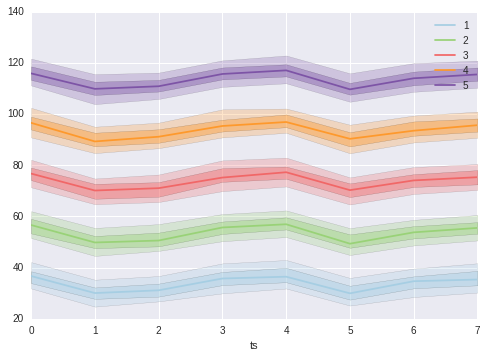
And now creating the plot.
ax = plt.subplot()
for idx, category in enumerate(data.category.unique()):
    category_data = data[data['category']==category]
    category_data.plot(x='ts',y='median', ax=ax,
                       color=colors[idx],
                       label=category)
    ax.fill_between(category_data['ts'],
                    y1=category_data['p_25'],
                    y2=category_data['p_75'],
                    alpha=0.40, facecolor=colors[idx])
    ax.fill_between(category_data['ts'],
                    y1=category_data['p_05'],
                    y2=category_data['p_95'],
                    alpha=0.25, facecolor=colors[idx])

Let me know what you think of this article on twitter @dumasraphael!