QGIS to Leaflet with QGIS2web
My first leaflet map using the qgis2web QGIS plugin. It is surprisingly easy to use to make nice Leaflet maps. Though unfortunately my custom rio metro .svg icons could not display.
Exploring census data for Rio de Janeiro.
The map below was made using census data on the ages of the literate population (ages 5-80), and the population age (ages 1-100). The work flow to create this map is described below.
Click here for a full page map.
Thoughts
The metro serves the denser areas (obviously), though the favela of Complexo Alemao, served by the gondola, is very high density.
The difference in average age was rather remarkable. With much older average ages in the core and substantially younger ones in the periphery. The difference is particularly striking when looking at Line 1 of the Metro versus Line 2. Many (American) tourists wonder why Line 1 doesn’t extend further into Ipanema and Leblon, parts of the city of particular importance to tourists. But anecdotal evidence from the few times I’ve taken the metro in rush points to far more people taking Line 2 from the North West of the city into the center for work.
Workflow:
I made the map below using the following steps:
- I made 1km buffers around every active BRT, Commuter Rail, Gondola, and Metro station.
- I intersected these buffers with census geometries, calculating the area of each polygon before and after the intersection.
- I summed up the columns for literate persons from age 18 to 65 in postgresql to get the total working age population for each polygon.
- In order to get an “average age” I multiplied each age column from 1 to 100 by the number of people in that age column. The following sed command was useful
sed -r 's_([0-9]+)_\1 * & \+_' <age_columns.txt >age_multiply.txtto repeat the number of the column (the age) after a multiplication symbol. - I then summed these two variables and unioned the shapes with:
SELECT a.id, a.nome, a.tipo_de_si,
    SUM( x_area/original_area *working_age_pop),
	ST_Union(a.geom) as geom
    INTO rio_stations_stats
FROM alfab_rio_stations_1000 a
    group by a.id, a.nome, a.tipo_de_si;
Finally:
- I colour-coded each line according to their official colours.
- And then used the plugin to create the map below, exporting the map to its own folder.
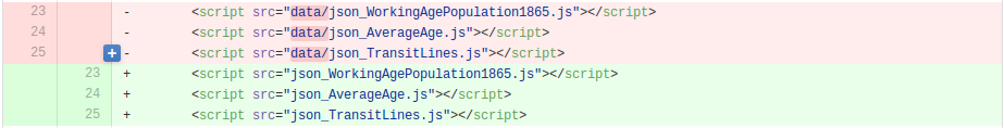
- The map displayed when testing jekyll locally, but the data wouldn’t load on gh-pages, so I had to do a small bit of editing. I had to move the contents of the
data/folder to the root folder of the map (where the map’sindex.htmlis located). And then edit the source paths inindex.htmlto remove “data”
- I then embedded the map into this post using an iframe. In order to get the iframe to be “responsive” (change size depending on the size of the window) I had to add some code to the css stylesheet and then wrapped the
<iframe>tags with a<div>. Unfortunately, mysteriously, this broke some markdown formatting outside the<div>tags, so I switched markdown parser tokramdown.
<div class = "leaflet-map">
<iframe src="/blog/maps/transit_working_age/index.html" height="600" width="900" frameborder="0" allowfullscreen> </iframe>
</div>
Wishes
QGIS2web plugin
It would be nice if the plugin:
- Could let you edit the variable names in the popups.
- Didn’t display the basemap radio button.
- Respected layer order. If you turn a layer off and then on, it automatically displays on top.
Things to play with
Some further things I would like to work on with this map:
- Displaying the legend in two columns
- Disabling scroll zoom without clicking on the map
- Restricting zoom levels
- I want to figure out how to display a table of the data as well, and then maybe do some linking and brushing to highlight, for example, the stations with the oldest average population.
Let me know what you think of this article on twitter @dumasraphael!