This one simple line of code could make your map mobile-responsive
Because making Bikeways mobile responsive ended up being easier than I thought, I decided to write a post so that someone else might (maybe) save themselves a lot of searching.
Desktop Launch
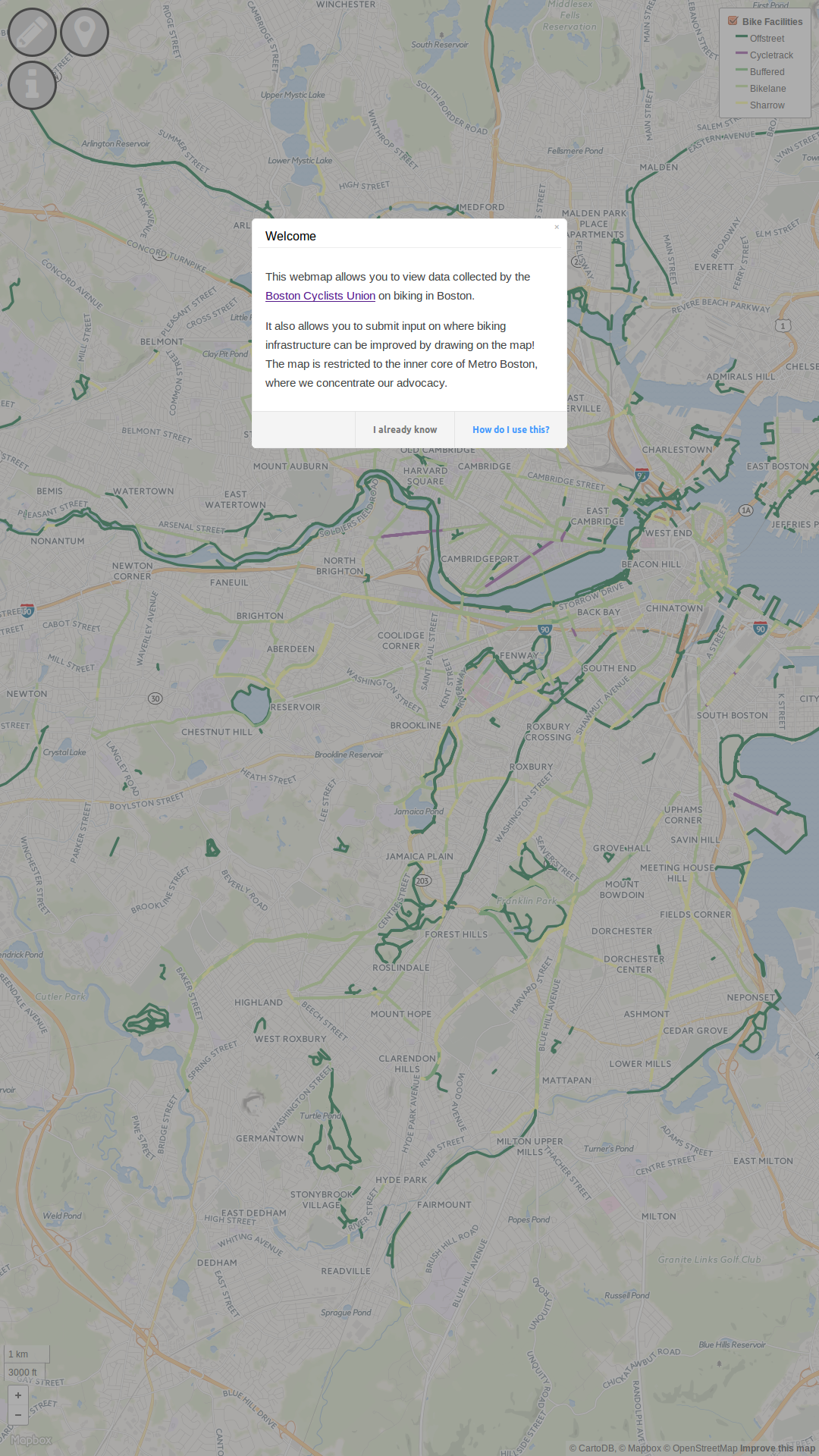
I launched the Bikeways for Everybody map in February with the design having been primarily aimed at a desktop browser. I rather erroneously thought that, through the magic of javascript, all of the plugins I used would look nice when I loaded the map on my phone.
I was wrong.
So I focussed on responding to feedback on the desktop experience while attending Code for Boston hacknights hoping to meet someone who was an expert in designing websites/maps for mobile. However, as I used it, biked around, and thought of different constituencies to promote the map to, I realized how valuable mobile would be.
A Pixel is not Actually a Pixel
It was only this past Tuesday that I finally got the chance to look at this problem. I had gotten pointed to A Pixel is not a Pixel a number of times, but had been confused by the fact that my phone’s screen has a better resolution than my laptop’s. I kept hearing a suggestion to use a <meta name="viewport" ...> tag, but didn’t want to push a change to the map to test it on my phone. What’s confusing about that article is that handheld device browsers apparently state a device-width in pixels that aren’t real pixels. So a 1080p display might actually be 320 px wide.
How did I eventually figure this out?
Well I started styling the icons in the top left in ems, which represents the pixels in an m character in the browser’s font and started testing the look on my phone. I couldn’t manage to pan around or zoom in on the map though on my phone, so I looked into what I could do to enable that and found this on stackexchange:
//This however does work for me:
<meta name="viewport" content="width=device-width, initial-scale=1.0, maximum-scale=1.0, user-scalable=no" />
There was that <meta name="viewport" ...> tag again. So I decided to test that out. Fortunately I had separated out the Bikeways project into two live sites: one on my personal github page, and the other on an account I created for Bike Union, so that in the future someone could modify the Union’s instance of Bikeways without necessarily needing me. Anyways, I inserted that one line of code into the header on the test site and… Things Just Worked™ (mostly).
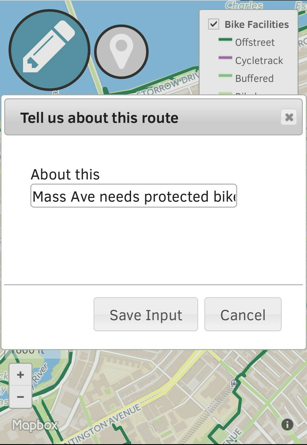
I’m now on to learning how to improve the UX on mobile. For example, the handy tooltips don’t appear anymore on mouse hover, because there’s no mouse. If you want to help in this phase of coding, check out these issues
Lessons learned:
- If a solution is one line of code, Just Do It™
- Having two separate live sites, one real, one for testing, helped make the above point easier
- A pixel is apparently not a pixel on mobile
Some Further Resources
- This leaflet tutorial to make a map for mobile.
Let me know what you think of this article on twitter @dumasraphael!